Design Tokens Integration Guides and Tutorials: Introduction and Demo Application Overview
Introduction
Each guide in this section will navigate you through the design tokens integration, usage, tips and tricks to kickstart your next project with CSS or JS framework. This page is dedicated to the common introduction part, since all guides are based on the same design.
Please find the source code on Github.
Overview
Here’s the application that will be used as an example:
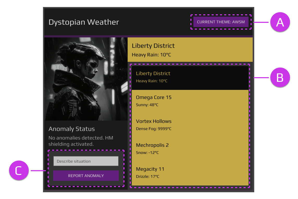
Conceptually it’s a retro-futuristic weather app - you can select a city and see the weather status in detail.
From the frontend perspective it’s a small SPA, consisting of several elements with a touch of interactivity. All demo projects are built upon a Vite/ReactJS template.
Visually application is using responsive layout and showcases all common UI elements - header, media content, text content, form, list, menu. There are 3 regions that worth separate mention:
- (A) - Theme selector. It’s based on a custom Select component and works accordingly.
- (B) - Interactive list of items. It behaves as a Radio Group element and in some cases uses related component under the hood.
- (C) - Basic form. It does not have any interactivity, but showcases the styling nuances on Input and Button elements.
Shared Resources
There are two shared projects inside the dtg-example repository.
- dtg-examples/common-data - exports data, image urls and typescript helpers.
Schema for the weather object looks like this:
  {
    uid: string;
    city: string;
    code: WeatherCodes;
    temp: number;
    status: string;
}- dtg-examples/common-tokens - exports font, foundation styles, design tokens and themes. Both design tokens and themes are generated with the Design Tokens Generator.
Theming approach is focusing solely on changing the color palette, however it’s possible to experiment further with the settings using the same principle. Theme is controlled viadata-themeattribute on thehtmlelement:
:root[data-theme='awsm'] {
  --awsm-color-primary: #9d0fbd;
  --awsm-color-primary-rgb: 157, 15, 189;
  --awsm-color-primary-contrast: var(--awsm-color-contrast-dark);
  --awsm-color-primary-contrast-rgb: 240, 240, 240;
  ...
}
App Structure
Let’s have an overview of application structure. It’s conveniently similar from project to project and difference is minimal, mostly in configuration files and such.
Note that in the structure below some files are omitted for presentation purposes.
public/
  images/

src/
  app/
    App.tsx

  components/
    header/
    info/
    list/
    picture/
    report/
    select/

  context/
    theme.tsx

main.tsxpublic/imagescontains media in.pngformat.src/componentscontains all respective parts of the app. It’s worth noting that in a real application scenario organization of components would be different, maximizing re-use of entities for consistency and scalability. For example, headings likeH2andH3are used a number of times, with duplicated code parts. This can be a single component with several variants. For the sake of demonstration this is not applied here.src/apppractically organizes all components in one location and binds the app with common state. Again, for the sake of demonstration this is a fine approach, however it is not recommended in real app.context/themecreates and exposes theme context and provider. Note that it’s very basic and does not persist the theme state.mainis the entry point for the app. In cases where there is no other provider used (i.e.ThemeProviderfrom MUI), structure looks as following:
  <React.StrictMode>
    <ThemeProvider>
      <App />
    </ThemeProvider>
  </React.StrictMode>
CSS and JS Frameworks Guides
Explore the individual guides focusing on particular CSS and ReactJS tools.
If you did’t find a specific technology and interested in a guide for some particular frontend tool, please let me know.